Why Your Walls Matter: Beyond Just Paint
Some walls just sit there looking a bit guilty.
You know the ones. The big blank patch above the sofa. The hallway that feels like a rental inspection is happening tomorrow. The bedroom wall that has been “nearly finished” since 2021.
Wall décor does a lot more than fill space. It changes how a room feels when you walk in. It can make a home feel warmer, calmer, brighter, more personal, or simply less like a white cardboard box.
The good bit? You don’t have to repaint the whole house or pretend you’re suddenly an interior design tragic. Start with one piece, one corner, one idea. If you’re browsing canvas art, framed prints or ready-to-hang art, Wall Art Collective is a handy place to start gathering inspiration without getting swallowed by 47 open tabs.
And no, your walls do not need to look like a display home. In fact, they’re usually better when they don’t.
Foundational Principles For A Balanced Display
Mastering The Rule Of Three
The Rule of Three sounds like something whispered by a very serious stylist in linen pants, but it’s simple.
Odd numbers often look better.
Three framed prints above a console. Five small pieces on a picture ledge. Seven objects across shelving. The human eye tends to enjoy groupings that feel balanced but not too perfect.
Too much symmetry can feel stiff. Too little structure can look like you panicked with a hammer.
For an easy gallery wall, try three minimalist line drawings in the same frame style. Or mix one small mirror, one artwork and one sculptural accent. That little trio can make an entryway feel considered, even if your keys are still missing and someone has left shoes in the doorway again.
Creating A Focal Point
Every room needs a main character. Not a drama queen. Just somewhere for the eye to land.
A focal point might be a large abstract painting above the sofa, a statement piece in the dining room, or soft landscape photography above the bed. It gives the room a bit of direction. Otherwise, everything competes at once, and suddenly your lamp, rug and wall-mounted TV décor are all yelling over each other.
Choose the largest or boldest piece first. Then let the rest of the room take cues from it. A piece with cream, green and gold tones might connect nicely with timber furniture, brass lighting or soft green cushions. If you’re trying to make the whole place feel connected, this guide on creating a cohesive home on the Gold Coast has some useful thinking around flow, materials and colour choices.
It doesn’t have to match perfectly. In fact, please don’t make everything match perfectly. That way lies hotel lobby energy.
Working With Colour And Tone
Colour can do the heavy lifting quietly.
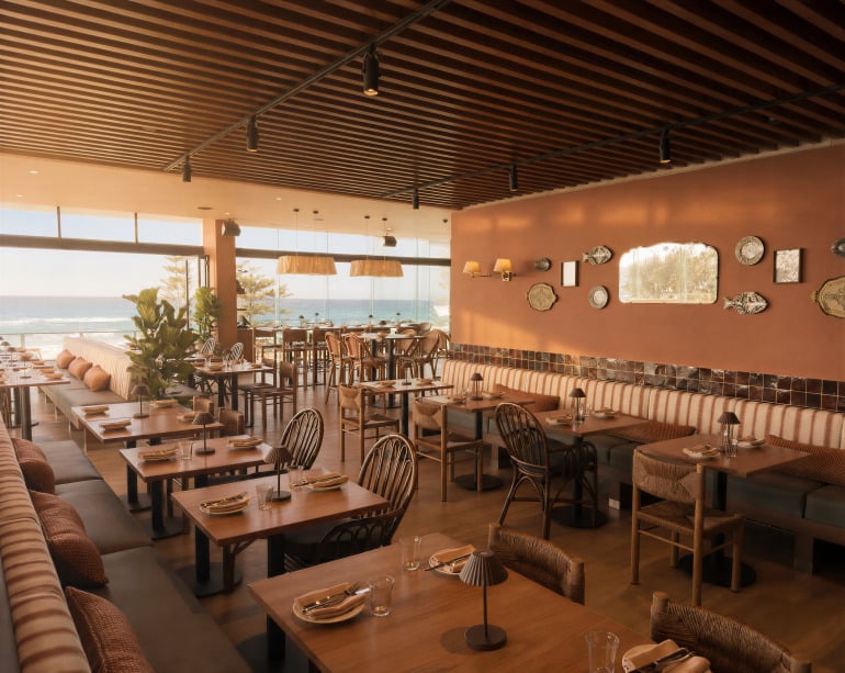
Cool tones like grey, blue, silver and sage tend to calm a room down. Warm tones like cream, terracotta, earthy brown and gold make a space feel cosy and grounded.
If your home uses a neutral palette, one accent colour can wake things up. A rust-toned print in a beige room. A blue canvas in a white hallway. A blush artwork in a bedroom with timber furniture.
For homes that lean breezy and relaxed, coastal home décor ideas can be a good starting point, especially if you’re playing with blue, white, sandy neutrals, timber and soft natural textures.
Repeat the accent colour once or twice nearby. A vase. A cushion. A lamp shade. Nothing too fussy. Just enough so the artwork feels invited to the party.
Matching Wall Décor To Your Furniture Style
This is where people sometimes get stuck. The room already has a style, but the wall is sitting there like it missed the memo.
If your home leans coastal or Hamptons, keep things light and relaxed. Soft landscape photography, pale blue artwork, white frames, rattan accents and curved mirrors usually sit nicely with linen, timber and bright natural light.
For industrial spaces, you can afford more contrast. Black frames, architectural prints, metal clocks, abstract painting and sculptural accents work well with leather, concrete, darker timber and exposed finishes.
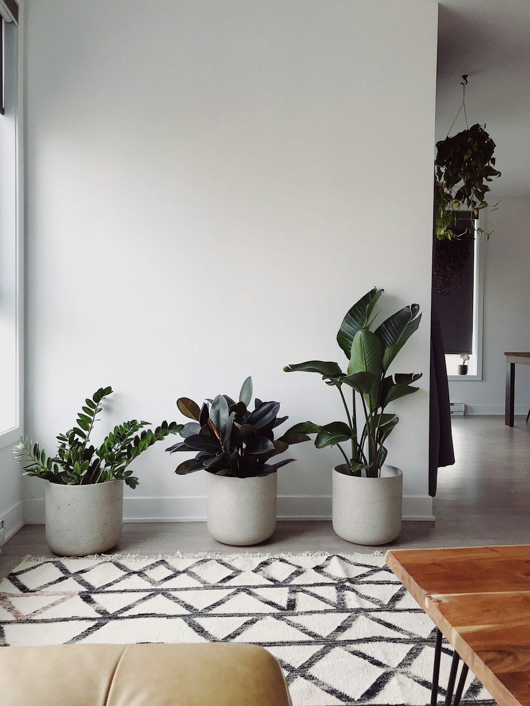
Modern homes tend to suit cleaner lines. Try large canvas art, minimalist line drawings, geometric pieces and a tighter colour palette. Less clutter, more breathing room.
For cottage, farmhouse or vintage-style rooms, softer choices often feel better. Botanical prints, warm timber frames, woven hangings and old-school mirrors can bring charm without making the room feel busy.
And if your style is “we bought things over time and hoped for the best”? Very normal. Repeat one colour, timber tone or frame finish across the room. That alone can make the whole thing feel more intentional.
Tailoring Your Décor To Every Space
The Entryway: Making A First Impression
Your entryway is the opening scene. It tells people what kind of home they’ve walked into before anyone says, “Do you want a drink?”
Entryway styling works best when it has confidence. A bold abstract painting, a vintage mirror, a slim picture ledge or a small cluster of framed prints can all do the job.
If the space is narrow, don’t overfill it. One strong piece can be better than six tiny things nervously clinging to the wall. Mirrored surfaces are useful here too. They bounce light around and make tight spots feel less poky.
Add a small shelf for keys if you need function. Add a hook if bags keep ending up on the floor. Then add art that gives the space a bit of backbone.
The Living Room: The Heart Of The Home
The living room cops a lot. Movie nights. Visitors. Lazy Sundays. Kids. Pets. That one chair everyone dumps clothes on even though nobody admits it.
For living room inspiration, scale matters first. A tiny print above a large sofa can look a bit lonely, like it wandered in by mistake. Go larger with canvas art, a wide landscape piece or a pair of framed artworks.
If you like a layered look, mix materials. A framed print, a textural wall hanging and a sculptural accent can bring depth without making the wall feel busy. This is where home styling gets fun, because texture adds personality in a way flat colour sometimes can’t.
Here’s a nice little styling move that looks more advanced than it is: build the wall in layers.
Start with something soft or tactile, like a woven panel, fabric piece or textured hanging. Then bring in a framed print, canvas artwork or small sculptural piece nearby so the wall has depth rather than just decoration sitting flat against paint. It works especially well beside a sofa, in a reading corner or above a sideboard where you want the space to feel a bit more finished.
The trick is to keep one element quiet and let the other do the talking. Otherwise it can all get a bit craft-market-at-9am.
Now, the TV wall. Annoying little beast.
Wall-mounted TV décor works best when the screen becomes part of a larger composition. Use shelving, storage, framed prints or a low cabinet to soften the big black rectangle. Keep the colour palette fairly calm so it doesn’t feel like the TV is fighting the art for custody of your eyeballs.
With more people putting real thought into their stay-at-home setup, the living room has become part cinema, part lounge, part social zone. This piece on how Gold Coast residents are redefining at-home entertainment touches on that shift, especially around comfort, smart lighting, acoustics and multi-functional spaces.
If the room has a hollow sound, acoustic wall treatments can help. Fabric panels, woven hangings, rugs and soft furniture can make the room feel warmer and less echoey. Functional décor, but not in a boring way.
The Dining Room: Sophistication For Socialising
Dining rooms can take a slightly moodier approach. They’re made for conversation, food, wine, family debates and someone saying, “I’ll just have a tiny slice,” before taking half the cake.
Grid layouts work beautifully in this space. Four or six framed pieces in a neat arrangement can feel polished without shouting. Landscape paintings also suit dining rooms because their wide shape often mirrors the table.
Want more dining room ambience? Try warm colours, black frames, gold touches or earthy photography. These details make the space feel settled and social.
Art in a dining room doesn’t need to be loud. It just needs to give the room some presence.
The Bedroom: Creating A Serene Sanctuary
Bedrooms should not feel like a shopping centre.
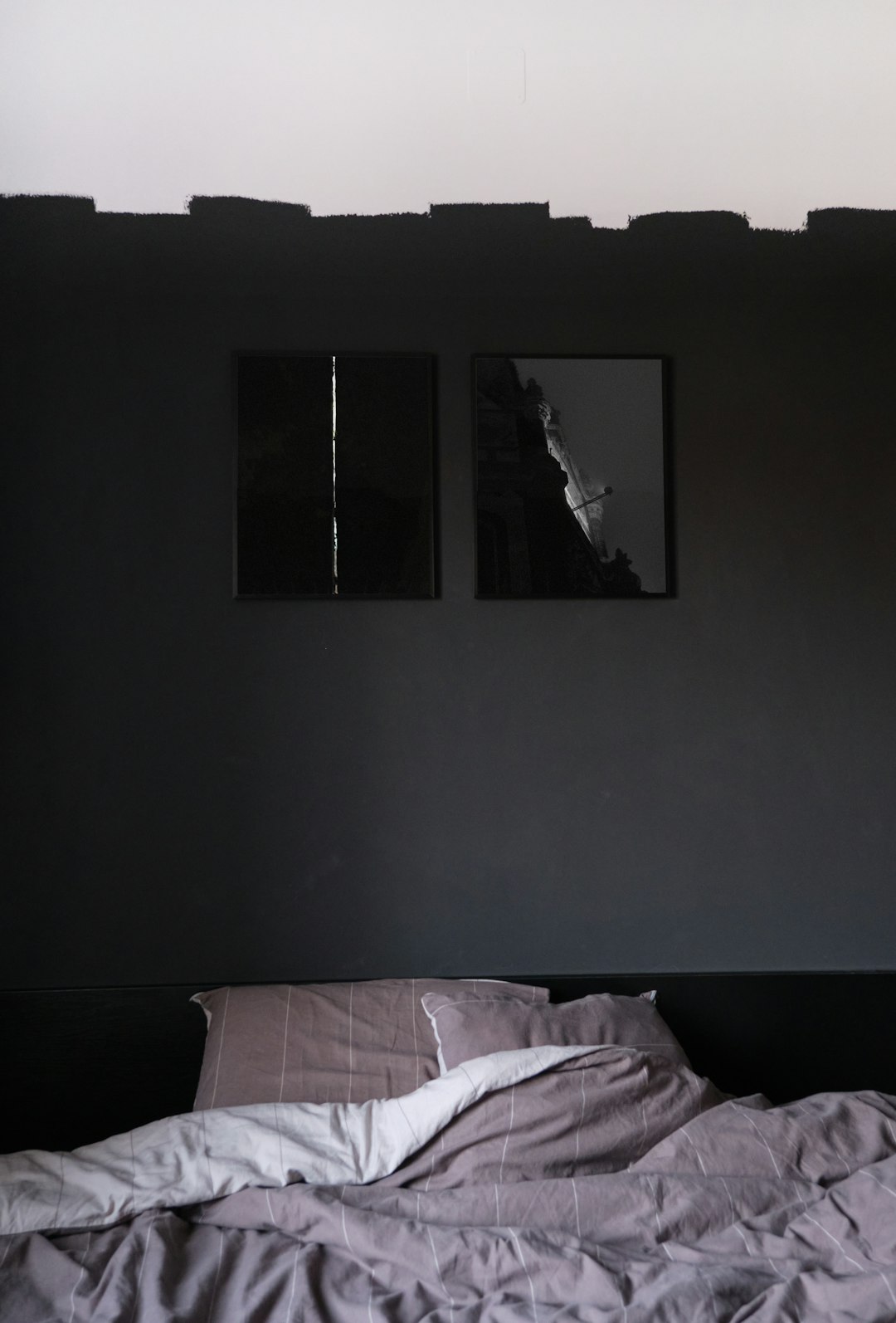
Keep the mood softer. Soft landscapes, abstract pastels, muted florals and black-and-white photography can bring calm without putting the room to sleep entirely.
Above the bed, a symmetrical trio works nicely. Three pieces in matching frames. Three canvas panels. Three quiet prints with a shared colour story. The repetition feels restful, which is the whole point.
If the room is small, resist the urge to cover every wall. One large piece can often do more than a cluster of smaller ones. Let the wall breathe a bit. You deserve breathing room too, frankly.
The Kitchen: Functional And Fun
Kitchens are allowed to have a sense of humour.
A framed recipe, playful typography print, fruit artwork or small gallery wall near a breakfast nook can add charm without getting in the way of dinner.
Just be practical. Keep art away from steam, oil splashes and heat. Nobody wants a beautiful print slowly marinating beside the stove.
Use wipeable frames where possible. Smaller pieces are often better than large delicate works in a busy kitchen. A bit of character, a bit of common sense. That’s the recipe.
The Home Office And Humidity-Safe Bathroom Décor
The home office has become its own little performance space. Even if the rest of the room is chaos, the bit behind your head on Zoom needs to look mildly together.
Minimalist line drawings, calm abstract art, tidy shelves and a picture ledge can all work well behind a desk. You want personality, but not so much that people stop listening and start studying your wall.
Bathrooms need different thinking. Moisture-resistant art matters, especially in rooms that get steamy. Choose sealed frames, materials that can handle damp air and pieces you won’t cry over if humidity gets cheeky.
A framed print in a powder room? Lovely. A delicate paper piece above a bath with poor ventilation? Risky business.
Creative Mediums To Add Dimension
The Magic Of Mirrors
Mirrors are sneaky little miracle workers.
They reflect light, open up narrow rooms and make small spaces feel more generous. A round mirror can soften a hallway full of straight lines. A large mirror opposite a window can pull natural light deeper into the room.
Mirrored surfaces also pair well with artwork because they add brightness without adding more colour. In a small lounge or entryway, that can be the difference between “cosy” and “why does this feel like a cupboard?”
Sculptural Accents And 3D Displays
Not every wall needs to be flat.
Sculptural accents, ceramic plates, woven baskets, timber shapes and textured hangings can make a wall feel more collected. They add shadow and depth, which is especially useful in rooms with plain paint and simple furniture.
Storage can join in too. Wall-mounted cabinets, cube shelving and slim display shelves create a three-dimensional effect while holding books, plants, ceramics or collage frames.
Sustainable décor can also fit here. Think timber, recycled materials, handmade pieces, second-hand finds or objects already sitting in a cupboard waiting for their comeback tour. For more ideas along this line, this article on incorporating natural elements into your interior décor goes into materials like stone, timber, textiles and greenery.
Clocks: Where Style Meets Function
A clock can be more than a round thing that reminds you you’re late.
Statement clocks can work as functional décor in kitchens, home offices, hallways and dining spaces. Choose one that suits the room’s tone. Black metal for contrast. Timber for warmth. Cream or stone finishes for something calmer.
It’s useful. It looks good. No app required. Imagine that.
Lighting As Art
Lighting changes the whole mood of a room. Fast.
Smart lighting, wall sconces, hanging pendants and warm LED bulbs can make artwork feel more intentional. A soft light above a statement piece can turn a plain corner into a proper feature.
Avoid harsh glare. You want glow, not interrogation-room drama. Warm lighting is usually friendlier for living rooms and bedrooms, while brighter task lighting suits kitchens and offices.
Layer it if you can. Ceiling light, lamp, wall light. Suddenly the room feels less flat.
How To Get The Look Without The Stress
Easy Gallery Walls
Gallery walls look relaxed when they’re planned. Annoying, but true.
Lay everything on the floor first. Move pieces around. Take a photo. Squint at it. Have a snack. Then decide.
Coordinated sets make this much easier because the colours, sizes or themes already work together. Collage frames are another good shortcut, especially for family photos or travel prints.
But don’t make it too perfect. A family-centric design should feel like people actually live there.
One easy way to do that is to give everyday memories a proper spot. Frame a child’s drawing in the same frame style as your other prints, add a holiday photo, or keep one small frame as the “rotating gallery” for new artwork from school, kinder or the kitchen table.
It adds warmth without turning the wall into a scrapbook explosion. And honestly, a wonky rainbow in a nice frame has more soul than half the expensive stuff people panic-buy for blank walls.
Ready-to-hang art also saves a lot of faffing about. Canvas art and framed pieces that arrive prepared are ideal if you want the wall finished without turning the weekend into a hardware store pilgrimage.
The Rental-Friendly Approach: Picture Ledges And Shelves
Renters, this is your loophole.
Picture ledges and shelves let you layer art without making a constellation of holes in the wall. You can lean framed prints, add small plants, display books or swap pieces around whenever the mood changes.
It’s also handy if you get bored easily. Some people change cushions with the seasons. Others rotate their art. Both are cheaper than moving house.
Seasonal Art Swaps And Trends To Watch
You don’t have to chase every interior trend. Please don’t. Doing it that way lies financial ruin and a cupboard full of cushion covers.
Still, small seasonal changes can make a room feel fresh without redoing the whole setup. In summer, lighter prints, coastal colours, white frames and airy textures can make a room feel breezier. In cooler months, earthy brown, muted green, soft gold, moody landscapes and warmer canvas art can give the space more weight.
For 2026, soft white and quiet neutral interiors are having a moment, with Pantone naming Cloud Dancer as its Colour of the Year. The useful takeaway isn’t “make everything white”. It’s to use calm base tones, then bring personality through texture, artwork and one or two accent colours.
Picture ledges make this easy. Keep the main layout, swap a few smaller pieces, and the room feels different without the drama.
Technical Tips For Perfect Placement
Eye-level hanging is a good place to start. As a rough guide, place the centre of the artwork around eye height.
Above a sofa, bed or console, keep the artwork connected to the furniture. Too high and it floats away. Too low and it feels cramped.
Check the wall type before hanging heavy pieces. Plasterboard, brick and concrete all need different fixings. Use proper hooks or anchors for larger artworks, because hoping for the best is not a hanging system.
For spacing, keep gallery wall gaps consistent. For one large statement piece, give it room. Simple.
Let Your Walls Do Some Of The Talking
You don’t need to solve every wall in one heroic afternoon.
Start small. Pick one blank area. Choose a focal point. Add colour, texture or a piece that feels like it belongs to your home, not a catalogue set nobody actually lives in.
Good wall décor should make a room feel more like you. Warmer. More finished. Maybe a bit braver.
Blank walls are patient, sure. But they do get a bit boring after a while.